 Acad
AcadFree QGIS and ArcGIS alternatives for researchers: an honest comparison
If you are hunting for free QGIS and ArcGIS alternatives for researchers, the honest answer is that no single tool wins on every axis: the right pick depends on whether you value a graphical interface, scripted reproducibility, or a fast path to a publication-ready figure. This guide compares QGIS, ArcGIS Pro, geopandas plus matplotlib, browser-based web tools, and AcadGIS on the criteria that actually matter for papers and theses. We name real tools and open data sources so you can choose confidently, then show where a code-driven, reproducible workflow saves you hours.
What researchers actually need from a mapping tool
Making a map for a slide is not the same as making a map for a journal. A research figure has to be publication-ready (clean projection, scale bar, north arrow, readable labels at 300 DPI), reproducible (regenerates identically when a reviewer asks for a revision), and ideally free so co-authors on any budget can rerun it.
That framing changes how you judge the usual suspects. QGIS and ArcGIS Pro are full geographic information systems, brilliant for analysis, but their figure output lives in a project file that a collaborator cannot easily diff or re-run. A scripting stack like geopandas + matplotlib is perfectly reproducible but asks you to hand-build every map element. The real question is not "which is best" but "which trade-off fits a paper deadline." Keep that lens as you read the comparison below.
Comparison table: free QGIS and ArcGIS alternatives at a glance
The table scores the main options on the six criteria researchers ask about most. Reproducibility means: can someone else regenerate the exact figure from a file or script, without clicking through your session? Publication output means built-in support for scale bars, north arrows, insets and high-DPI export.
Read it as a shortlist, not a verdict. QGIS remains the default free desktop GIS, and nothing here replaces it for heavy vector editing or spatial analysis. The point is narrower: for the repetitive job of producing a clean figure for a manuscript, a code path is often faster and safer, and a purpose-built GIS map for a research paper should be reproducible by default.
| Tool | Cost | Learning curve | Reproducibility | Publication output | Code / no-code | Offline |
|---|---|---|---|---|---|---|
| QGIS | Free (open source) | Moderate to steep | Low (project file, manual) | Strong (Print Layout) | No-code + Python console | Yes |
| ArcGIS Pro | Paid (license) | Steep | Low (proprietary project) | Strong | No-code + arcpy | Partly |
| geopandas + matplotlib | Free (open source) | Steep (Python) | High (full script) | Manual (you build it) | Code | Yes |
| Web tools (Datawrapper, kepler.gl) | Free to freemium | Low | Low to medium | Medium (web export) | No-code | No (browser) |
| AcadGIS | Free (Apache-2.0) | Low (few lines) | High (script + data) | Strong (built in) | Code now, no-code web app coming | Yes (bundled countries) |
QGIS and ArcGIS Pro: the desktop heavyweights
QGIS is the best free ArcGIS alternative for full desktop GIS. It is open source, runs on Windows, macOS and Linux, reads shapefiles, GeoPackage, GeoTIFF, PostGIS and more, and its Print Layout produces genuinely publication-grade figures. If you need to digitize features, run spatial joins, or wrangle a raster, install QGIS first. Its embedded Python console (PyQGIS) even gives you a scripting escape hatch.
ArcGIS Pro is the industry standard in many labs, with deep analysis toolboxes and polished cartography. But it is proprietary and costly, tends to be tied to a university site license, and its arcpy scripts are not portable to collaborators without the same license. For both tools, the catch is identical: the figure is the product of a session. Six months later, reproducing it means remembering which layers, styles and layout settings you used, a fragile basis for a reviewer revision.
The Python route: geopandas, cartopy, folium and friends
If reproducibility is your priority, a scripting stack is the honest answer, and it is completely free. geopandas handles vector data as a pandas dataframe; matplotlib and cartopy render static, projection-aware figures; contextily pulls basemap tiles; and folium builds interactive Leaflet maps for the web. Data comes from open sources such as GADM boundaries, Natural Earth, OpenStreetMap, and rasters like Copernicus GLO-30 and ESA WorldCover.
The strength is total control and a script anyone can rerun. The cost is time: you assemble the map element by element, load boundaries, set the CRS, place the scale bar, tune the legend, fix label collisions. For a one-off analysis that is fine. Across a thesis with a dozen study-area figures, that boilerplate becomes the bottleneck, which is exactly the gap a higher-level library fills.
AcadGIS: a QGIS alternative in Python you can script in minutes
AcadGIS is a free, Apache-2.0 Python package built for one job: turning research map requests into a few honest lines of code. It sits on the same open foundations (geopandas, matplotlib, Natural Earth, GADM, OpenStreetMap) but ships academic defaults, scale bar, north arrow, graticule and a clean theme, so you skip the boilerplate. Bangladesh, Iraq, India and the USA are bundled offline; other countries download by name.
A classed choropleth from a spreadsheet is a single call, with name-matching to the boundary layer handled for you:
import acadgis as agis

gdf = agis.load_boundaries("India", level="state")
ax = agis.choropleth(gdf, data="literacy.csv", on="state",
                     value="rate", scheme="quantiles",
                     palette="viridis", title="Literacy by state")
agis.save("literacy.png", dpi=300)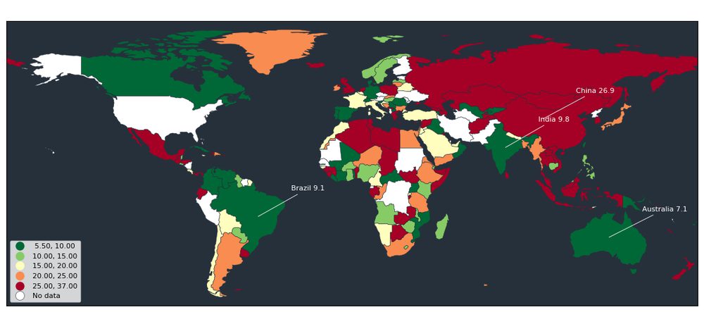
Study-area and terrain figures without the layout grind
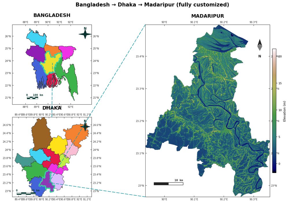
The most common thesis figure, a country inset with a highlighted region, connectors, and a zoomed detail panel, is where manual tools cost the most time. AcadGIS treats it as one cascade, the same layout the dedicated study-area map generator produces:
Because the figure is defined by code plus data, it is fully reproducible: change the region, add terrain, or drop in rivers and rerun. That gives you the reproducibility of the Python route with the speed of a no-code tool, and the terrain layer comes from an open Copernicus GLO-30 DEM.
import acadgis as agis

fig = agis.study_area("Bangladesh",
    steps=[("division", "Dhaka"), ("district", "Madaripur")],
    template="cascade", terrain=True, rivers=True, labels=True)
agis.save("study_area.png", dpi=300)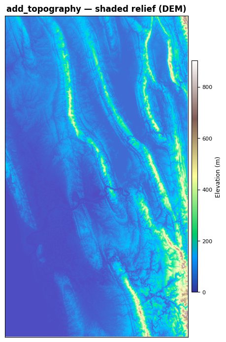
No-code GIS for research: what is coming
Not every researcher wants to write Python, and that is fair. Web tools like Datawrapper and kepler.gl offer genuine no-code mapping, but they are browser-bound, weaker on print-grade cartography, and leave no reusable artifact. QGIS is no-code too, but at the cost of reproducibility.
AcadGIS is closing that gap with a browser-based, no-code GIS for research app that generates the same study-area, choropleth and terrain figures through a point-and-click interface, while still letting you export the underlying code so your figure stays auditable. Until then, the four-to-ten-line snippets above are the fastest reproducible path. The practical recommendation: keep QGIS for analysis, reach for AcadGIS when the deliverable is a clean, repeatable figure for a paper or thesis.
Frequently asked questions
What is the best free alternative to ArcGIS for researchers?
QGIS is the best free, open-source alternative to ArcGIS for general desktop GIS, offering cross-platform support and publication-grade Print Layouts. For reproducible paper figures specifically, a code path such as geopandas plus matplotlib, or AcadGIS, is often faster because the figure regenerates from a script rather than a saved session.
Is there a QGIS alternative in Python?
Yes, geopandas with matplotlib and cartopy is the core scriptable stack, and higher-level packages like AcadGIS wrap them with academic defaults so a study-area or choropleth map takes only a few lines. These Python routes trade a graphical interface for full reproducibility.
Are QGIS and AcadGIS really free?
Yes, QGIS is free and open source under the GNU GPL, and AcadGIS is free and open source under the Apache-2.0 license, installable with pip install acadgis. Neither requires a paid license, unlike ArcGIS Pro.
Can I make publication-ready maps without ArcGIS?
Yes, QGIS Print Layouts, a geopandas or matplotlib script, or AcadGIS all export high-DPI figures with scale bars and north arrows suitable for journals. AcadGIS applies these academic elements by default and exports at 300 DPI in one call.
Is there a no-code GIS option for research?
Yes, with trade-offs: QGIS is no-code but hard to reproduce, and web tools like Datawrapper or kepler.gl are easy but browser-bound and weaker for print. AcadGIS is building a no-code web app that generates reproducible figures while still exporting the underlying code.
Which mapping tool is most reproducible for a thesis?
A code-driven workflow is the most reproducible, because the figure is defined by a script plus data and regenerates identically for reviewer revisions. geopandas and AcadGIS both offer this, whereas QGIS and ArcGIS Pro store figures in session-based project files that are harder to reproduce.