 Acad
AcadSampling Site Map Generator for Field Research
A sampling site map generator turns a table of field coordinates and measurements into a publication-ready figure, plotting each site by latitude and longitude and scaling it by what you measured. AcadGIS does this in a few lines of Python, drawing graduated symbols on a clean study-area basemap.
What a sampling site map generator is and why researchers need it
A sampling site map generator takes the coordinates where you collected data - water-quality stations, soil pits, biodiversity transects, air-quality sensors, sediment cores - and draws them on a map of your study region. Instead of a flat scatter of identical dots, it uses graduated symbols: each marker's size and colour encode the value measured at that site, so nitrate concentration, species richness or PM2.5 becomes visible spatial pattern.
Researchers need this because a sampling design is only convincing when reviewers can see it. A good site map answers three questions at once: where did you sample, how were the sites distributed across the study area, and what did you find. Doing this by hand in desktop GIS is slow and hard to reproduce; a code-driven generator regenerates the exact figure whenever your data changes. For the surrounding boundary context, AcadGIS pairs naturally with a study area map generator and a broader research area map generator.
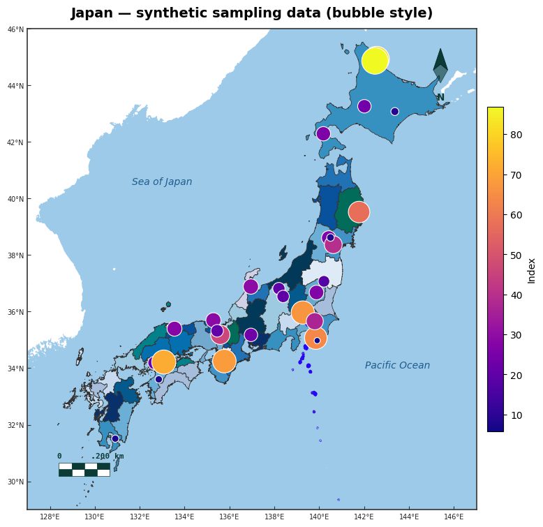
Make a sampling site map in Python
Load a study-area boundary, draw it, then overlay your sites. The points() function reads your longitude and latitude columns and uses value for colour and size_by for proportional symbol area - that combination is the graduated-symbol map.
Your table (a pandas DataFrame or CSV) needs at least three columns: lon, lat and one measured value. AcadGIS handles the projection, legend and basemap so the figure is publication-ready by default.
import acadgis as agis
gdf = agis.load_boundaries("Bangladesh", level="district")
ax = agis.plot(gdf, title="Water-quality sampling sites")
sites = agis.pd.read_csv("sites.csv")  # columns: lon, lat, nitrate
agis.points(ax, sites, lon="lon", lat="lat",
            value="nitrate", size_by="nitrate", cmap="viridis", legend=True)
agis.save("sampling_sites.png", dpi=300)
Add basemap context: satellite, terrain and rivers
Bare points on white can look ungrounded. AcadGIS lets you drop your sites onto meaningful context so a reader immediately understands the setting. Add a satellite image with add_basemap(ax, style="satellite"), hillshaded terrain with add_topography(ax), or the drainage network with add_rivers(ax) - which is especially useful when a sampling design follows a river, as covered in the river network map generator.
Because every layer targets the same ax, you build the figure up one context layer at a time and keep full control of the visual hierarchy: basemap underneath, boundary and graticule in the middle, graduated site symbols on top.
import acadgis as agis
gdf = agis.load_boundaries("Bangladesh", level="district", within="Dhaka")
ax = agis.plot(gdf, title="Field sites, Gazipur")
agis.add_basemap(ax, style="satellite")
agis.add_rivers(ax)
sites = agis.pd.read_csv("sites.csv")  # columns: lon, lat, depth
agis.points(ax, sites, lon="lon", lat="lat", value="depth", size_by="depth")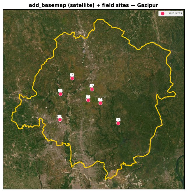
Example use cases across disciplines
The same workflow covers a wide range of fieldwork:
- Environmental science: nitrate, dissolved oxygen or heavy-metal concentrations at water-sampling stations, sized by value.
- Ecology: species richness or abundance per transect or camera-trap location.
- Public health: air-quality sensors or clinic case counts as graduated dots across a city.
- Geology and soils: core sites or soil-organic-carbon measurements over terrain.
When you want a continuous surface between sites rather than discrete symbols, the same coordinate table feeds interpolate_field() and add_isopleth() for interpolated contours - but graduated symbols remain the honest default when sampling is sparse, because they show exactly where you have data and where you do not.
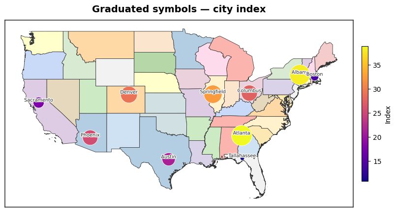
Data sources and practical tips
Your site coordinates come from your own GPS field logs - just export a CSV with longitude, latitude and your measured columns. For the surrounding map, AcadGIS uses trusted open sources so the base layers are citable: administrative boundaries from GADM via load_boundaries(), satellite and street basemaps from OpenStreetMap and imagery providers, terrain from Copernicus GLO-30, land cover from ESA WorldCover, and coastlines and rivers from Natural Earth.
A few tips for clean figures: always store coordinates as decimal degrees in WGS84 (EPSG:4326); check for swapped lon/lat if points land in the ocean; keep the legend readable by binning to a handful of size classes rather than every raw value; and set a title and export at 300 DPI with agis.save("fig.png", dpi=300) for print. When one value spans several orders of magnitude, colour (value) carries the detail while size (size_by) carries the headline magnitude.
How to make a sampling site map in AcadGIS
- Prepare your site table. Export a CSV with longitude, latitude and at least one measured value column (for example nitrate or species count), using decimal degrees in WGS84.
- Load the study-area boundary. Call agis.load_boundaries(country, level="district") to get a clean GADM boundary for the region you sampled in.
- Draw the basemap. Pass the boundary to agis.plot() with a title, and optionally add satellite, terrain or river context with add_basemap, add_topography or add_rivers.
- Overlay graduated site symbols. Call agis.points(ax, sites, lon="lon", lat="lat", value="col", size_by="col") so each site is coloured and sized by its measured value.
- Export at print resolution. Save the figure with agis.save("sampling_sites.png", dpi=300) for use in a paper, thesis or report.
Frequently asked questions
What data do I need to make a sampling site map?
You need a table with a longitude column, a latitude column and at least one measured value column. AcadGIS reads it as a CSV or pandas DataFrame and plots each row as a site.
How do I make marker size represent the measured value?
Set size_by to your value column in the points() call to get proportional (graduated) symbols. You can also pass the same column to value so colour and size both encode magnitude.
Can I put my sampling sites on a satellite or terrain basemap?
Yes. Call add_basemap(ax, style="satellite") for imagery or add_topography(ax) for hillshaded terrain before plotting your points. Every layer draws onto the same axis so the sites stay on top.
What coordinate system should my coordinates be in?
Use decimal degrees in WGS84 (EPSG:4326), which is what most GPS units and phones export. If points land in the wrong place, the most common cause is longitude and latitude being swapped.
Which data sources does AcadGIS use for the basemap?
Boundaries come from GADM, terrain from Copernicus GLO-30, land cover from ESA WorldCover, coastlines and rivers from Natural Earth, and satellite or street imagery from OpenStreetMap and imagery providers. Your site coordinates come from your own field logs.
Can I show a continuous surface instead of discrete symbols?
Yes. The same coordinate and value arrays feed interpolate_field() and add_isopleth() to draw interpolated contours. Graduated symbols remain the honest choice when sampling is sparse, since they show exactly where you have data.
Is AcadGIS free to use for this?
Yes. AcadGIS is free and open-source under Apache-2.0 and installs with pip install acadgis. A no-code web app for the same maps is coming soon.