 Acad
AcadHexbin Spatial Analysis Map: Reveal Point Patterns in Python
A hexbin spatial analysis map aggregates thousands of overlapping points into equal-area hexagonal cells so density patterns jump out instead of drowning in a scatter of dots. AcadGIS builds hexbins, kernel heatmaps, interpolated surfaces, and dot-density maps from the same point table in a few lines of Python.
What is a hexbin spatial analysis map and why researchers need it
A hexbin spatial analysis map divides a study area into a tessellation of equal-area hexagons and colours each hexagon by how many point observations fall inside it (or by the sum of a per-point weight). It answers the question a scatter plot cannot once you have thousands of overlapping points: where is the density actually concentrated?
Researchers reach for hexbins because square grids exaggerate patterns along their axes and dot maps collapse into an unreadable blob past a few thousand records. Hexagons have six equidistant neighbours and uniform area, so gradients read cleanly in any direction and no cell is closer to its diagonal neighbours than its edge ones. Typical uses include species occurrence records, crime or accident points, survey responses, sensor pings, and sampling coverage. When you need value surfaces rather than counts, the same workflow extends to kernel heatmaps and interpolated figures for a research paper.
Make a hexbin map in Python
Point AcadGIS at two coordinate arrays and it bins them into hexagons automatically. The kind="hexbin" argument forces hexagonal aggregation; weights lets you sum a magnitude per point instead of counting events.
This example loads a country outline for context, then overlays the hexbin density of an occurrence table:
import acadgis as agis
df = agis.pd.read_csv("occurrences.csv")   # columns: lon, lat
usa = agis.load_boundaries("USA")
ax = agis.plot(usa, title="Occurrence density (hexbin)")
agis.add_heatmap(ax, df.lon, df.lat, kind="hexbin", cmap="inferno")
agis.save("hexbin.png", dpi=300)
Beyond hexbins: kernel heatmaps, isopleths and dot-density
Hexbins are one member of a family of point-aggregation techniques, and AcadGIS keeps them one argument apart:
- Kernel heatmap — set
kind="kde"inadd_heatmap()for a smooth density surface instead of discrete cells. Good for continuous phenomena and presentation figures. - Interpolated isopleths — when each point carries a measured value (temperature, pH, elevation),
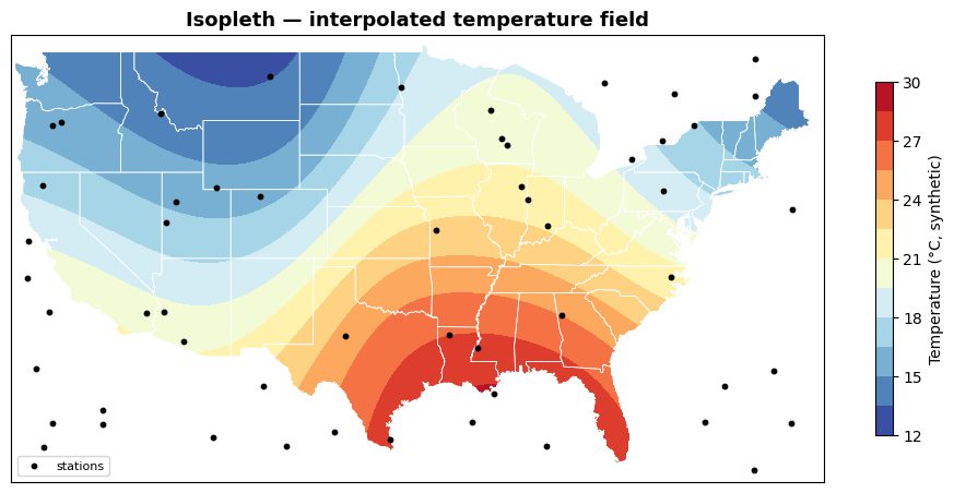
interpolate_field()builds a continuous grid andadd_isopleth()draws labelled contour bands. - Dot-density —
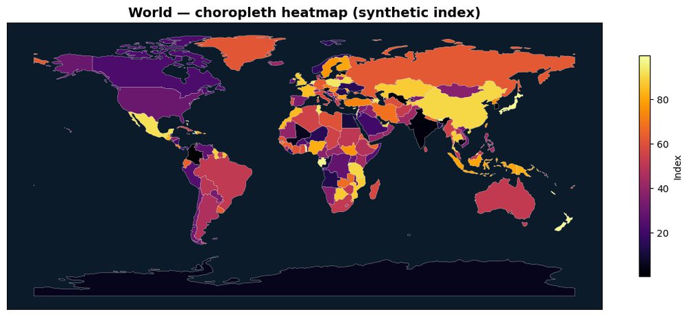
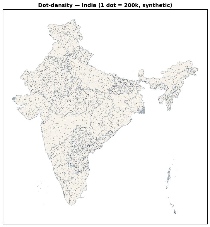
dot_density()scatters one dot per N units of a regional total, a classic way to show magnitude without shading whole polygons like a choropleth does.
Because all of these read the same point table, you can prototype every view before deciding which one carries your argument.
Interpolated surfaces and dot-density in code
For measured values, interpolate first, then draw isopleths. interpolate_field() returns a (Z, extent) tuple you pass straight to add_isopleth():
Dot-density instead works from a boundary GeoDataFrame joined to a count column, one dot per fixed count — see the choropleth map generator for the shaded-polygon alternative to the same data.
import acadgis as agis
Z, extent = agis.interpolate_field(df.lon, df.lat, df.temp, res=320)
ax = agis.plot(agis.load_boundaries("Iraq"), title="Temperature field")
agis.add_isopleth(ax, (Z, extent), levels=12, cmap="RdYlBu_r")
agis.save("isopleth.png", dpi=300)
Example use-cases across disciplines
The technique you choose follows the data:
- Ecology — bin GBIF occurrence records into hexbins to show sampling effort versus true range, then overlay a sampling site map to check for coverage gaps.
- Public health — kernel heatmaps of case coordinates to flag clusters without exposing individual addresses.
- Climate and soil science — interpolated isopleth fields from weather-station or soil-plot measurements.
- Demography — dot-density maps where one dot equals a fixed number of people, avoiding the area-size bias of choropleths.
Data sources and practical tips
AcadGIS supplies the geographic frame; you supply the points. Administrative boundaries come from GADM and Natural Earth, with satellite and terrain context available from Copernicus GLO-30, ESA WorldCover, and Sentinel-2. Point tables can be any CSV, pandas DataFrame, or GeoDataFrame carrying longitude and latitude columns; occurrence data often comes from GBIF, and base features such as roads and rivers from OpenStreetMap.
Practical tips: keep every layer in the same coordinate reference system before binning, since hexagons drawn in degrees are not equal-area far from the equator. Pass weights when points represent aggregates rather than single events. Prefer kind="kde" for smooth presentation figures and kind="hexbin" when reviewers need to read exact cell counts. Raise interpolate_field(res=...) for finer isopleths at the cost of compute, and for two-variable questions pair bivariate() instead of a single density surface.
How to make a hexbin spatial analysis map in AcadGIS
- Install and import. Run pip install acadgis, then start every script with import acadgis as agis.
- Load your points. Read a table with longitude and latitude columns using agis.pd.read_csv() into a DataFrame.
- Add a boundary for context. Call agis.load_boundaries(country) and pass it to agis.plot() to draw a base map and get an axis.
- Aggregate into hexbins. Call agis.add_heatmap(ax, df.lon, df.lat, kind="hexbin") to bin the points and colour each hexagon by count.
- Switch views or interpolate. Use kind="kde" for a smooth heatmap, or agis.interpolate_field() plus agis.add_isopleth() for a value surface.
- Export at print resolution. Save the figure with agis.save("hexbin.png", dpi=300) for a publication-ready image.
Frequently asked questions
What is a hexbin spatial analysis map?
It is a map that aggregates point observations into a grid of equal-area hexagons, colouring each hexagon by the count or summed weight of the points inside it. This reveals density hot spots that overlapping scatter points obscure.
How do I make a hexbin map in Python with AcadGIS?
Call agis.add_heatmap(ax, lon, lat, kind="hexbin") on an axis returned by agis.plot(). AcadGIS bins the coordinates and colours each hexagon automatically, and you export with agis.save() at 300 dpi.
When should I use a hexbin instead of a kernel heatmap?
Use a hexbin when reviewers need to read discrete, comparable cell counts, and a kernel heatmap (kind="kde") when you want a smooth continuous density surface for presentation. Both come from the same add_heatmap() call in AcadGIS.
How is a hexbin different from an interpolated isopleth map?
A hexbin counts how many points fall in each cell, while an isopleth interpolates a measured value such as temperature into a continuous surface. In AcadGIS use add_heatmap() for counts and interpolate_field() with add_isopleth() for value fields.
Can AcadGIS weight points by a value instead of just counting them?
Yes, pass a weights array to add_heatmap() and each hexagon reflects the summed weight rather than a raw count. This is useful when points represent aggregates such as population or biomass.
What data do I need to build a hexbin map?
You need a table with longitude and latitude columns as a CSV, pandas DataFrame, or GeoDataFrame. AcadGIS provides the boundaries from GADM and Natural Earth, and works offline for Bangladesh, Iraq, India and the USA.
Is AcadGIS free for making spatial analysis maps?
Yes, AcadGIS is free and open-source and installs with pip install acadgis. It targets researchers and PhD students making publication-ready figures for papers, theses, and reports.